Simple Email Tips that Work
Email Response Rates Down? Try an Ultra-Simple Email.
After seeing a variety of overly complicated emails come through my inbox recently, I thought it might be helpful to talk about an effective and highly refreshing approach: the simple email.
Here, I'm skipping over all the email best practices and focusing solely on how adding a few simple email templates to your marketing mix might be your ticket to improved response rates.
When I'm working with clients, one of the first questions I ask is, "What's the last business email you remember getting?" Most people answer that they don't remember a single one. A few will recall an email on a topic they're interested in. The experienced marketer knows full well that audiences are busy and live in a world of information overload. Nevertheless, they continue to send emails that are overly written and overly designed.

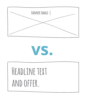
#1: Remove that big banner image and replace it with a headline.
About 50% of people have their images turned off in email. So that huge image you have at the top of your layout will end up being a huge gray box unless you have some fancy code in there that may or may not work with your recipient's email client. That's what we call a Marketing Fail.
Make sure your headline is actual text, not just an image of text. Put your eye-catching images farther down in your layout, or in your off.
#2: Keep your headline short and put your big, fancy words down below.
Let's face it: people have become numb to marketing buzzwords. The more of them we use, the less street cred we retain. Instead, try using short, pithy headlines as a hook. Let your subhead or body copy shoulder the details.
Bad example:
Streamline and automate your month-end accounting processes to save time and effort for your entire back-office staff.
Good example:
Close month-end books in hours.
#3: Get your offer to the top of your email.
Why am I still having to scroll down to see offers in email? It's better to put your offer in plain sight in the preview pane. The quality of your offer is 40% of the reason someone will respond, so make sure your audience can see it. Also, make sure your offer is in writing and not just an image because, again, many people turn images off in their email.

#4: Make sure your call-to-action buttons are text, not images.
The same point about images applies here: if your CTA button is an image and the recipient has their images turned off, they won't be able to respond. Some simple text on a solid background is a perfectly acceptable way to make a button. There's no need for fancy effects such as drop shadows. Just give your button some white space and your viewer will thank you with a click.

#5: Trim your body copy.
It's not just because people read only 20% of the words they see online, or because fewer than 10% of people read body copy—it's because emails are not supposed to be a novel. The shorter your copy, the better your response rate. Focus your copy on the offer and the problem you're solving for your audience. Do your best to limit your copy length to under 40 words. If you have a more complex story to tell, you can always add extra content in a landing page.

#6: Don't include social links.
Social links are an invitation for your audience to leave the party. You wouldn't send a wedding invitation and include a footnote about the party across the street. So why give your recipient an avenue to leave your campaign? It's better to put your social links at the end of the process in your thank-you page.

The next time you're refreshing your email template, consider adding a few ultra-simple emails into the mix. You'll enjoy the improved results.